Logo Design
Logo Design
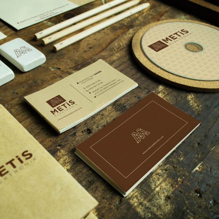
Poster designs can be categorized into two main categories: information-oriented posters and visual-oriented posters. It should be noted that logos are basically divided into text-based and visual-based. We say basically because these types have many more subcategories, such as asymmetrical, aggressive, complex form, and calligraphic logo. Text-based logos are created by revealing the brand name with specially designed fonts. On the other hand, visual-based logos are produced mainly by designing original or sectoral-based graphics that describe the work done directly.
Which Steps Does a Successful Logo Work Consist of?
The logo analysis of the competitor companies in the sector to be studied should be made, and the dominant forms and colors should be determined. The aim is to create an original work that is not similar to theirs.
An understandable and catchy draft should be created by the message to be given. Instead of logos made in 5 minutes with ready-made graphic programs, the outlines should be decided by drawing continuously with drafts on paper with a pen.
Suppose the created draft is not in an easily recognizable and understandable form for the logo to be made. In that case, a new draft should be started because the important thing is that the brand has a catchy and easily recognizable logo.
During the work, ready-made materials that we call stock images should be avoided. While there are companies with your logo in many parts of the world, it isn’t easy to get a patent, and you cannot succeed in globalization with a non-original logo.
It is not necessary to keep up with fashion to succeed in logo design. After all, the logo we will reveal will perhaps create its style.
It is always essential to use the right colors. In general, take care to work using two or three colors. Otherwise, it is both difficult to remember, and the number of companies with different colors than three that have achieved particular success is very few.
When your logo is displayed in an open square, people should not have questions in their minds. Asking yourself many questions while still in the design phase is a crucial step to avoid rewinding your work.
The logo should appear correctly in every area that is necessary for the sector and can be used at the same time. The same image quality should prevail in all of them, whether shared on social media, printed on the phone cover, or dressed on the building.
Classics never die! Make sure that this phrase is said for the work you will do. The company should be able to use the logo you made even 50 years from now.
Do not use any unnecessary elements in your work. Using a single color and simple design for professional logo design will perhaps make it your best work. The boundaries of these two basic categories are not very sharp. For example, many designers use both visual-oriented and informational poster designs.
The main difference between information-oriented and visual-oriented posters is the profound spirit between the two types. Visually oriented posters aim to attract people’s attention by conveying more emotion. Information-oriented posters, on the other hand, aim to get news, ideas, or, more generally, information. Especially when we look at information-oriented posters, we see that the methods used to attract people’s attention are striking visual or text forms. On the other hand, in visual-oriented posters, designers try to attract people’s attention with striking colors and drawings.
In essence, using motifs that can attract people’s attention for both types is very important for the success of your poster design. What is more important than these motifs is their harmony with each other. For example, you need to pay attention to the balance of the colors you choose in your design with your logo and overall corporate identity.


